
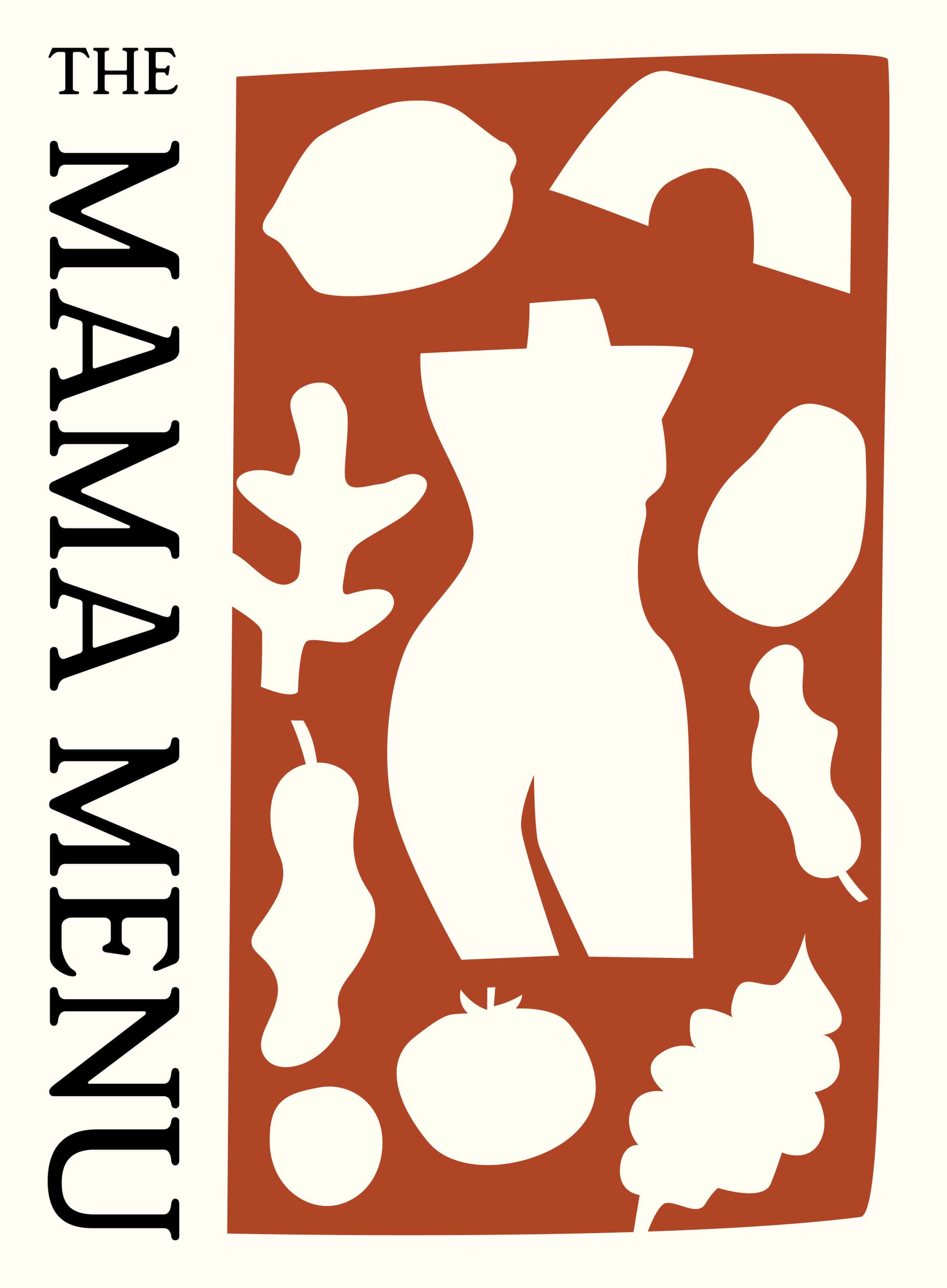
The Mama Menu
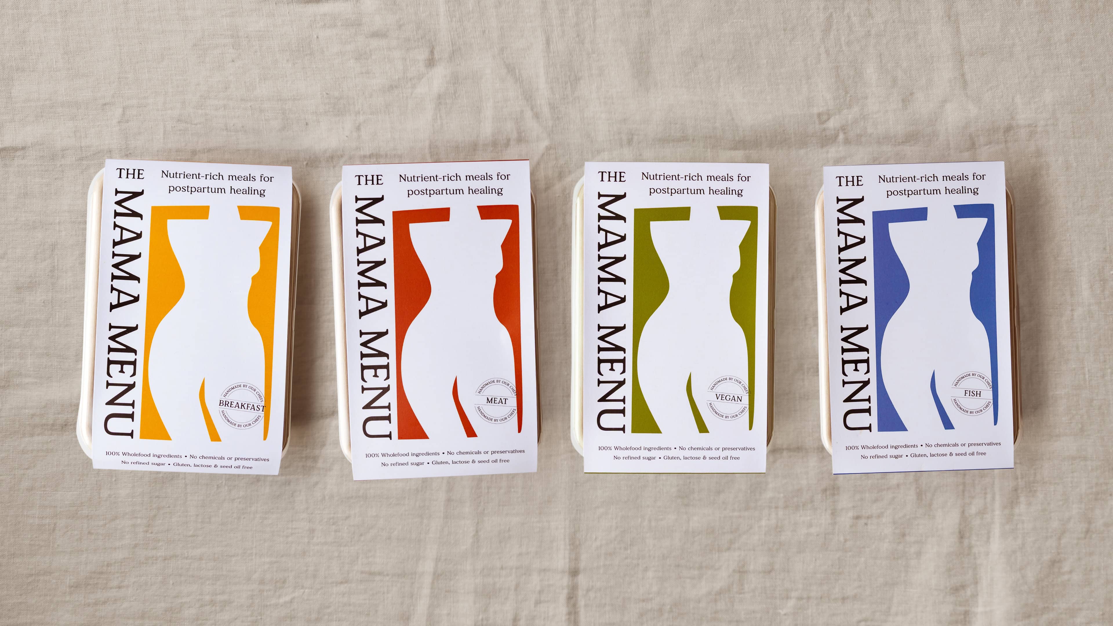
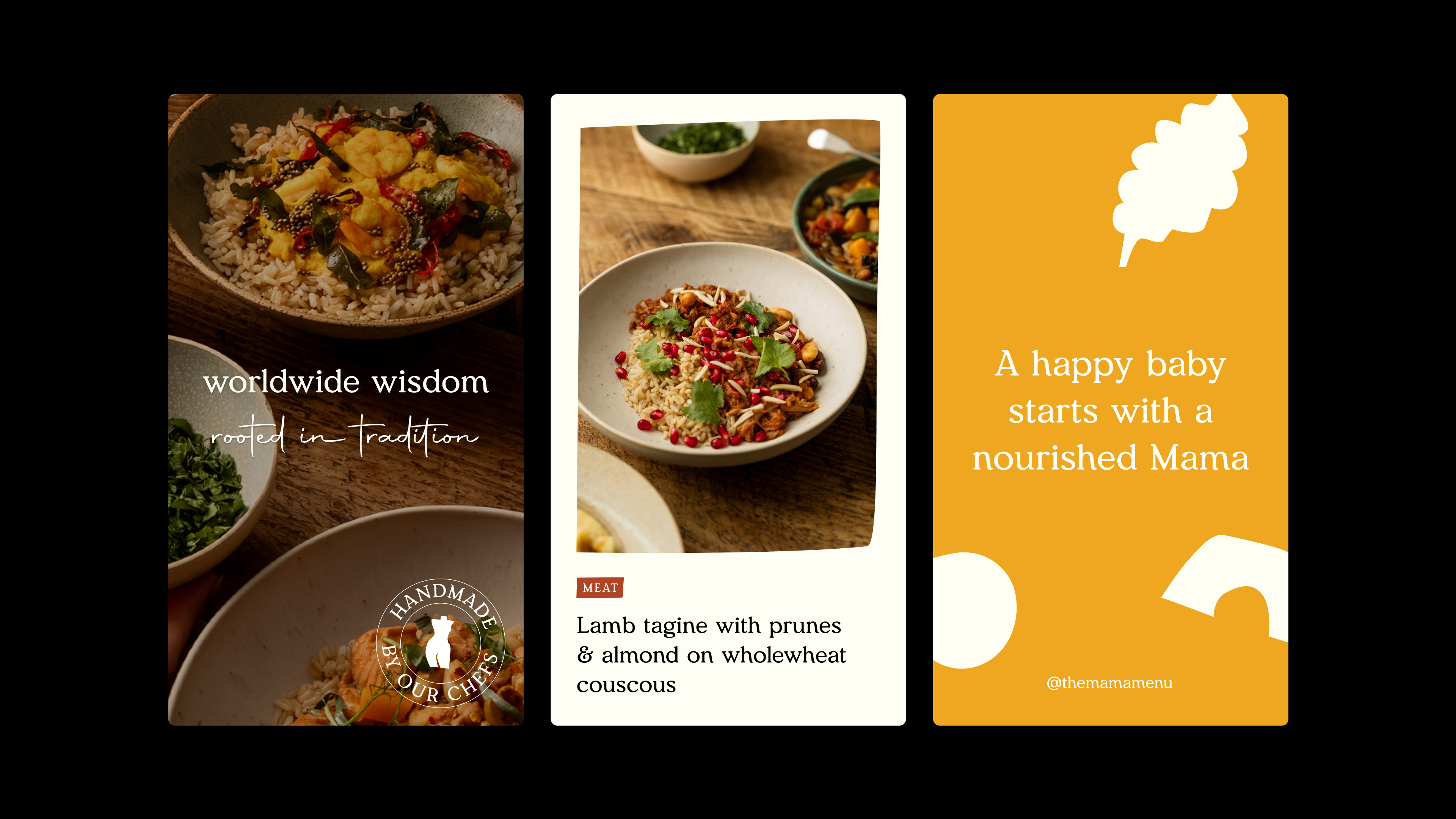
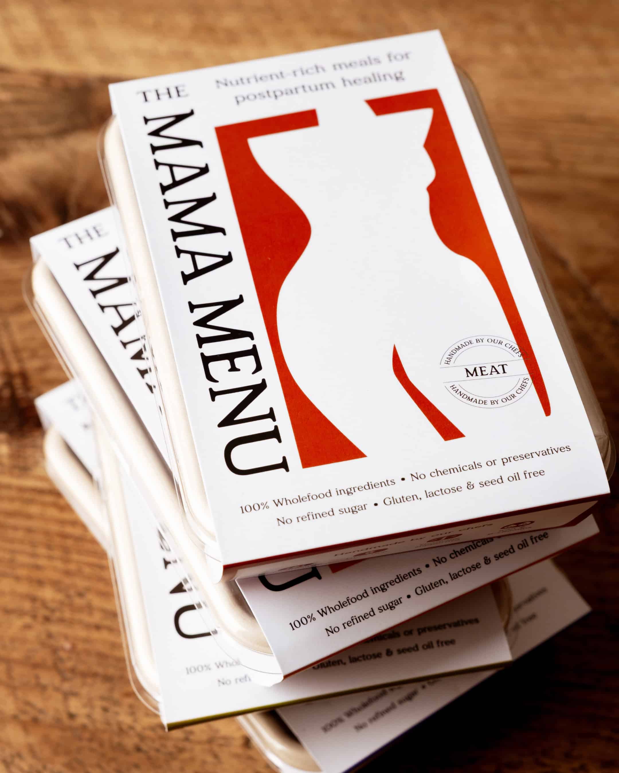
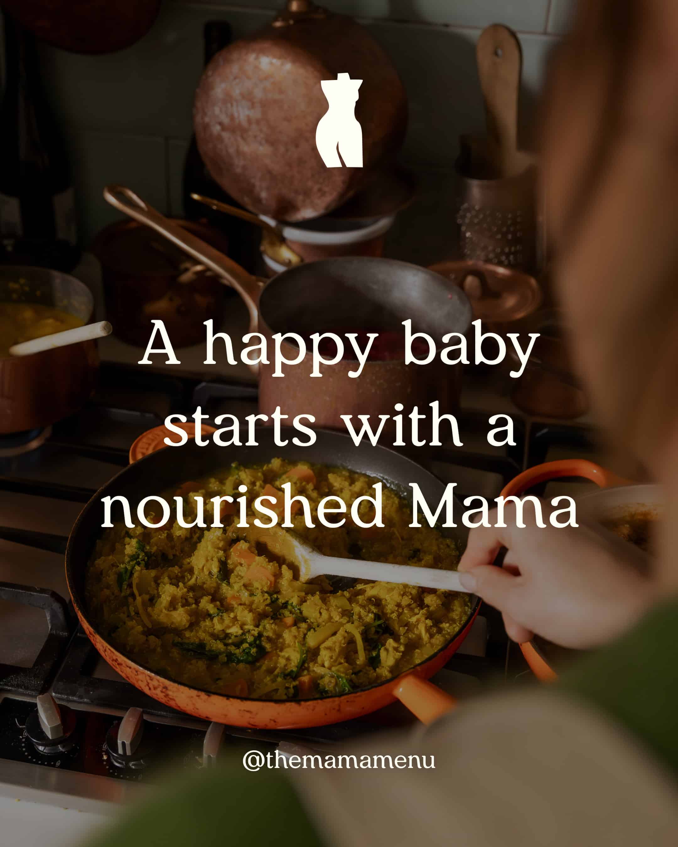
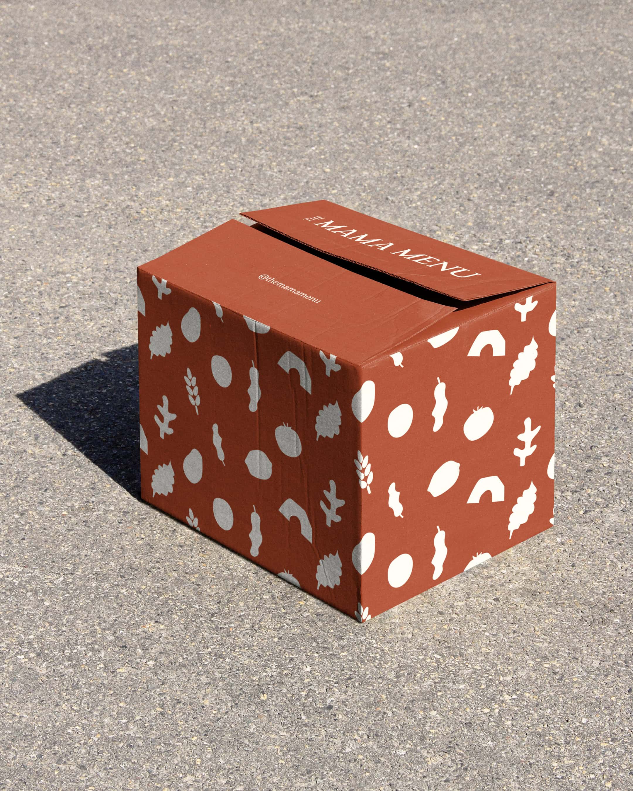
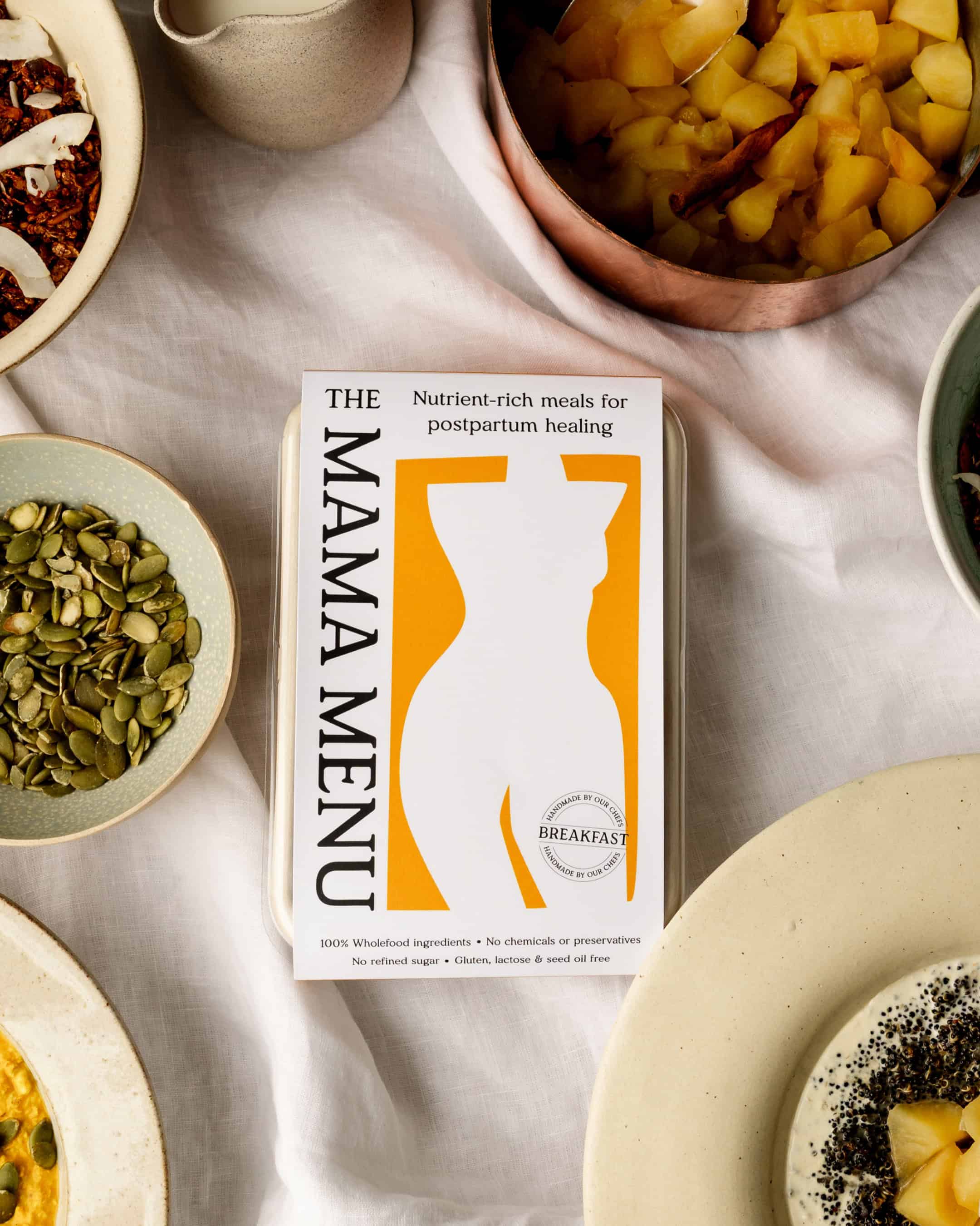
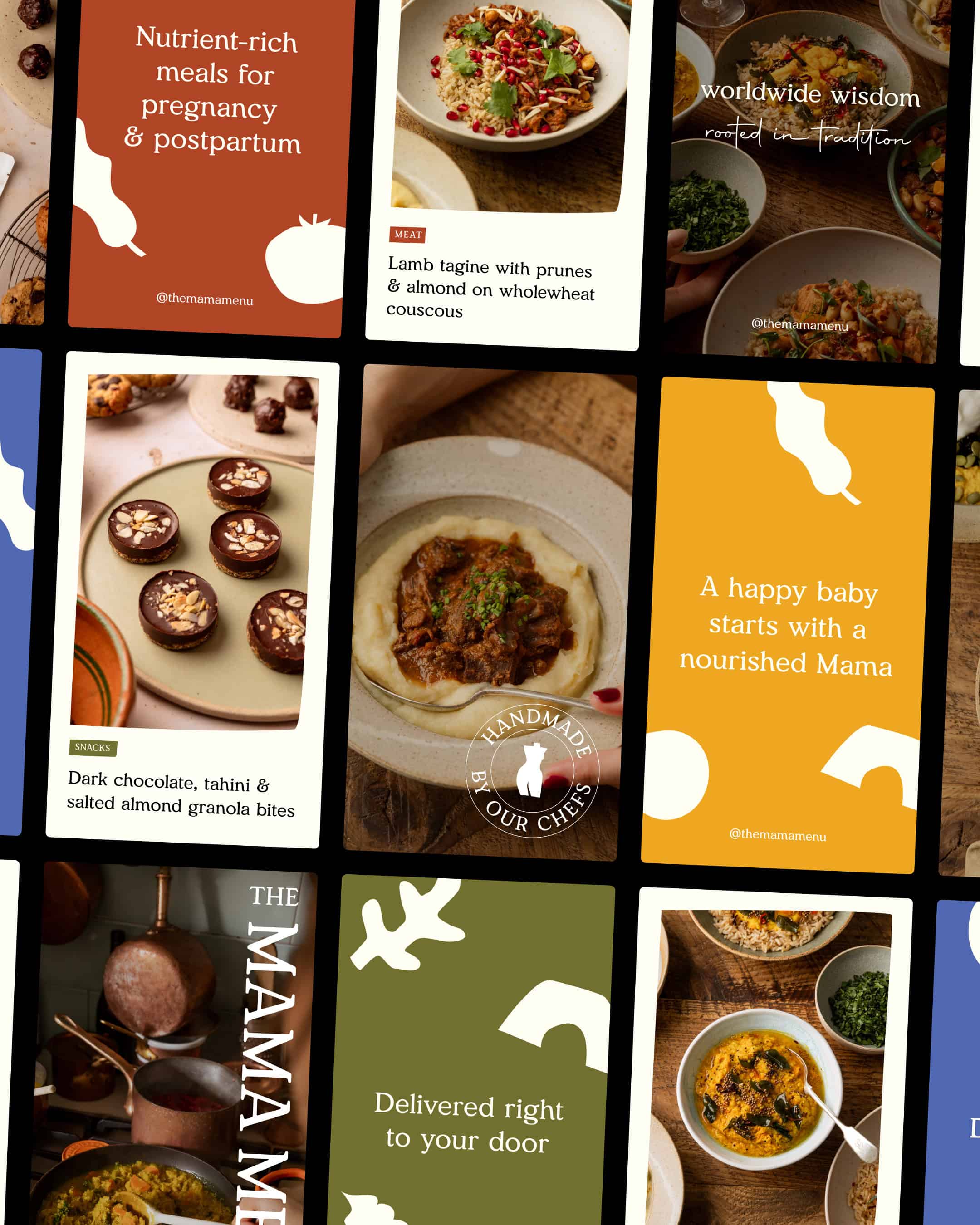
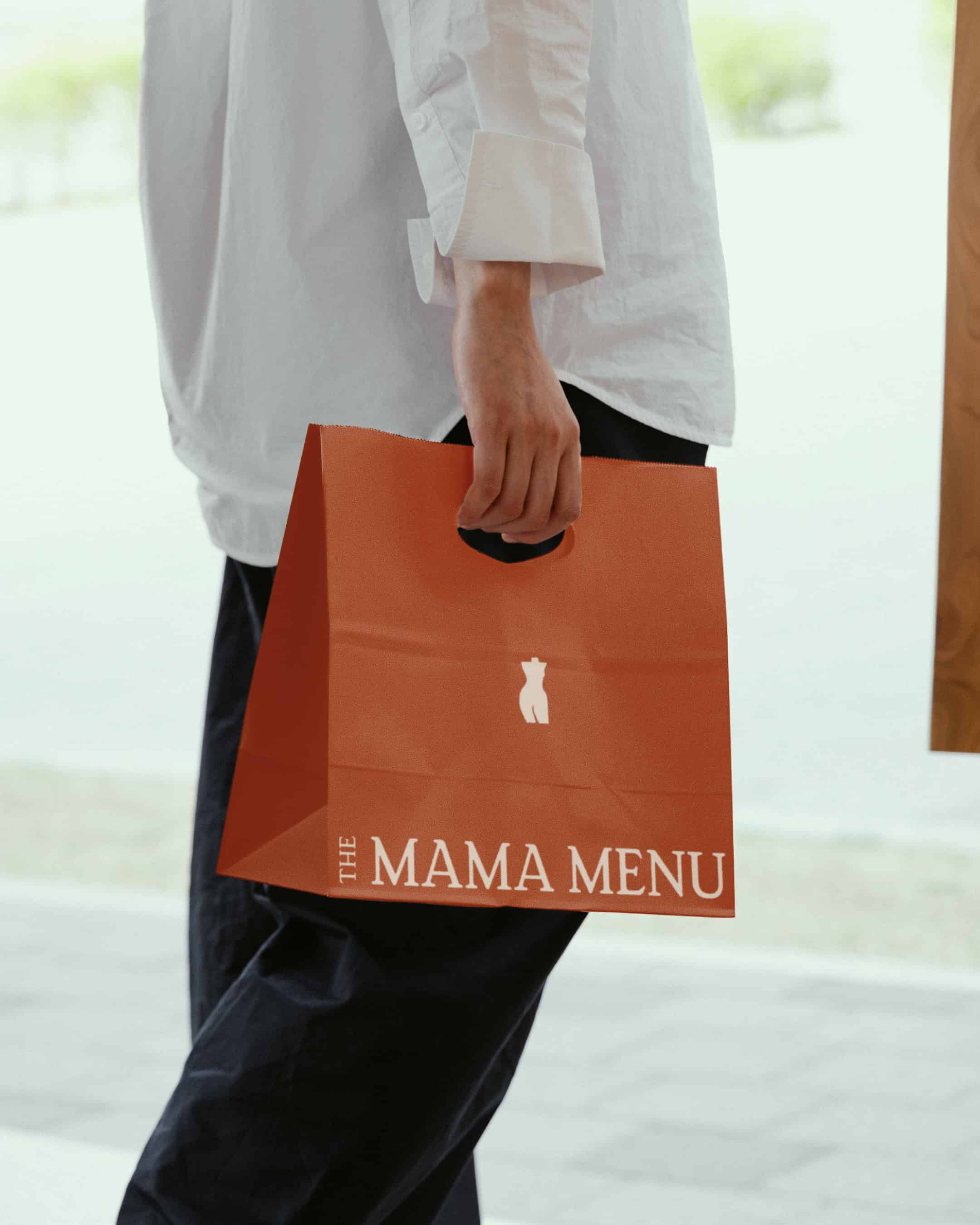
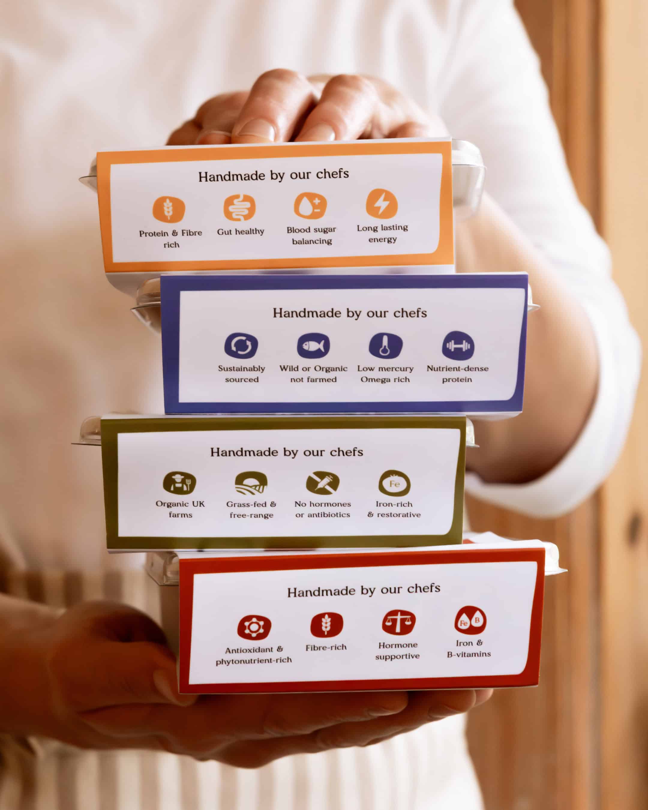
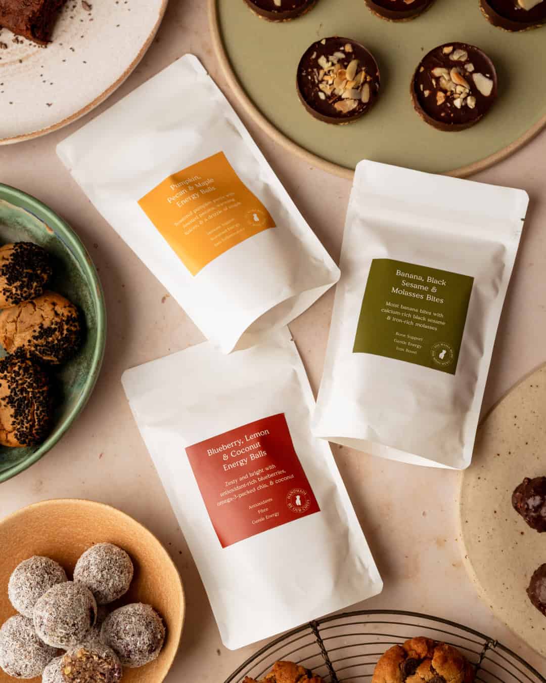
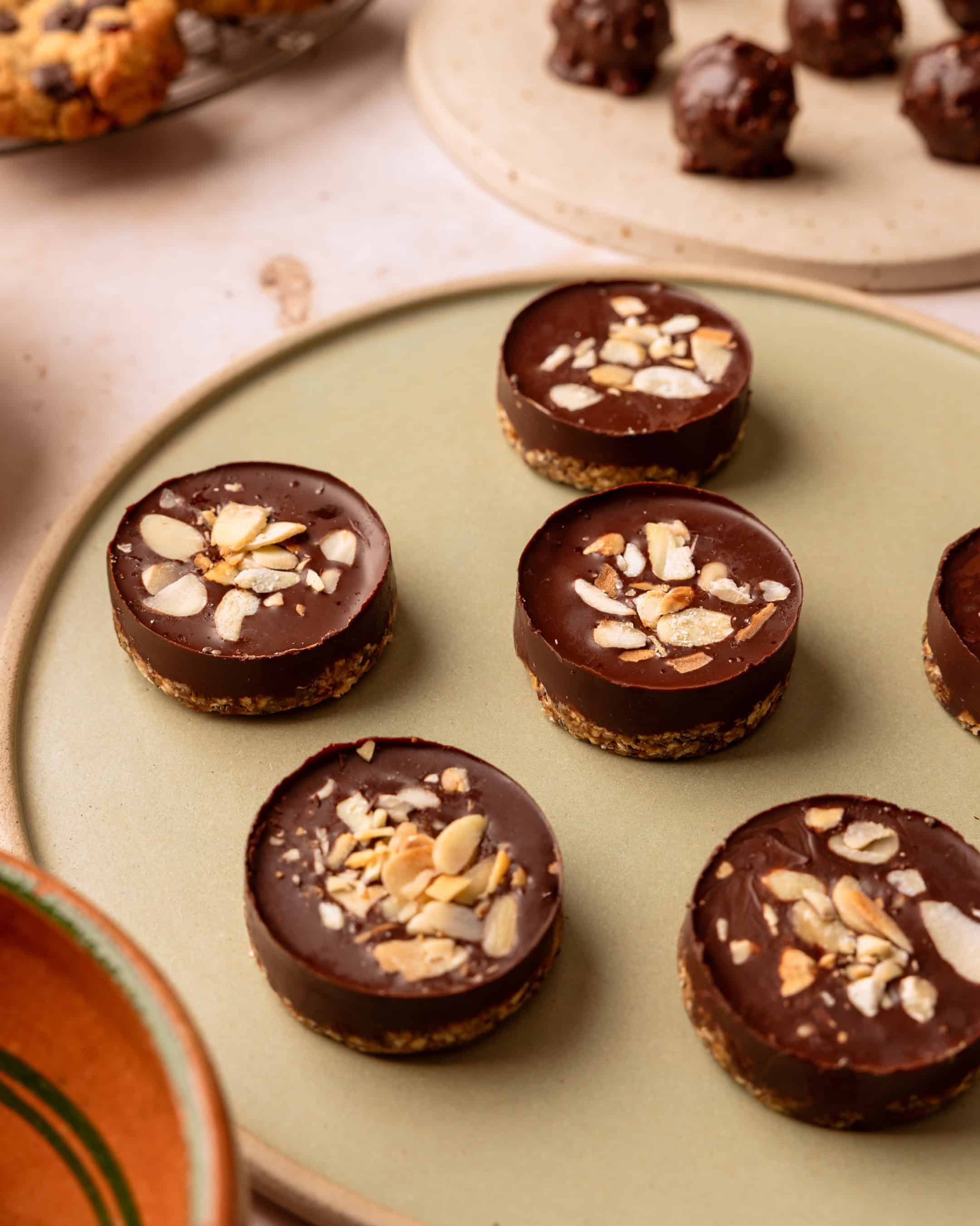
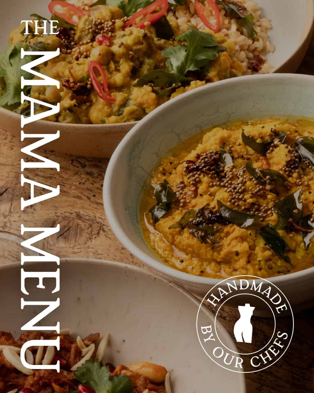
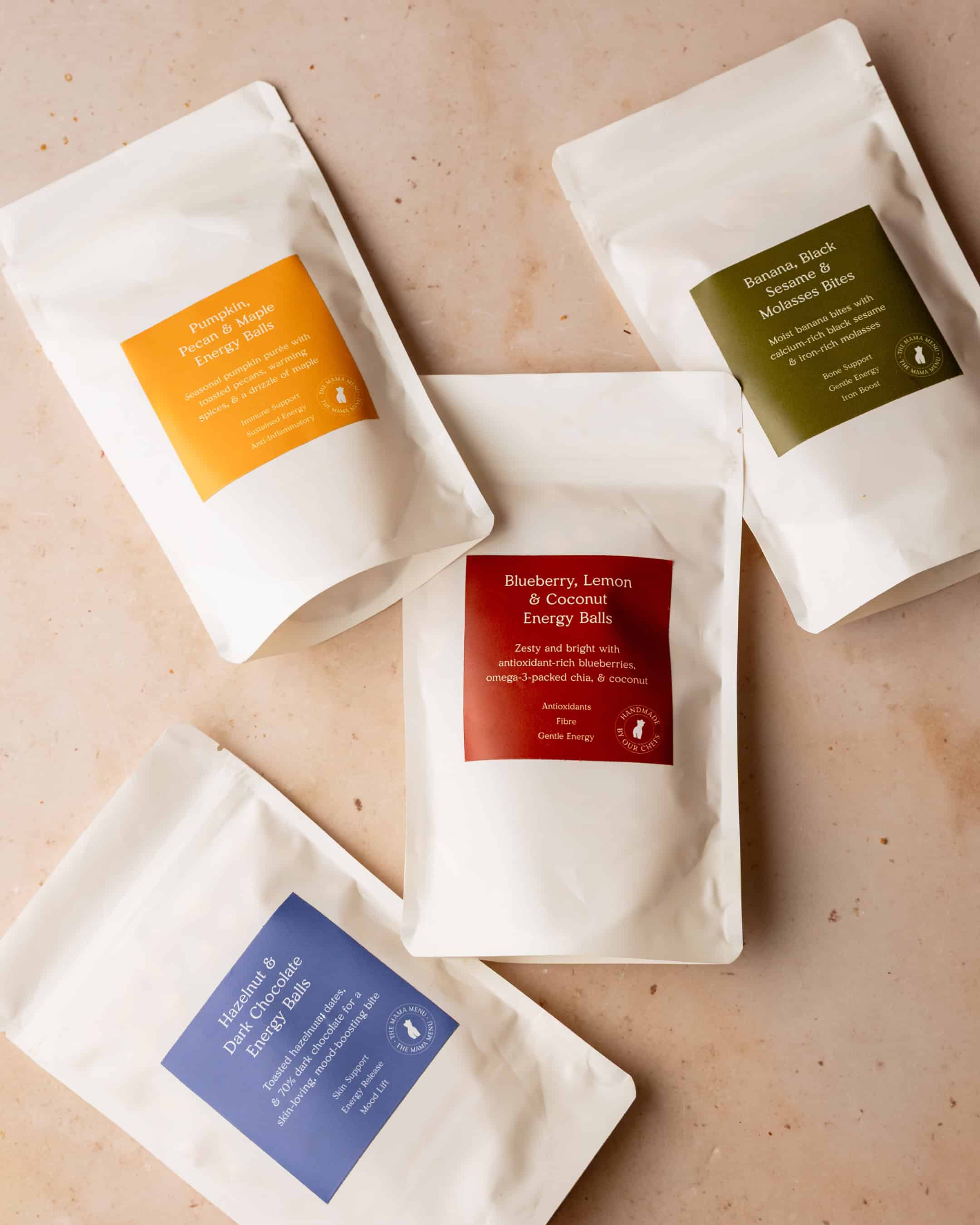
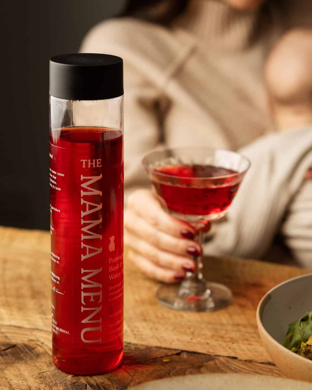
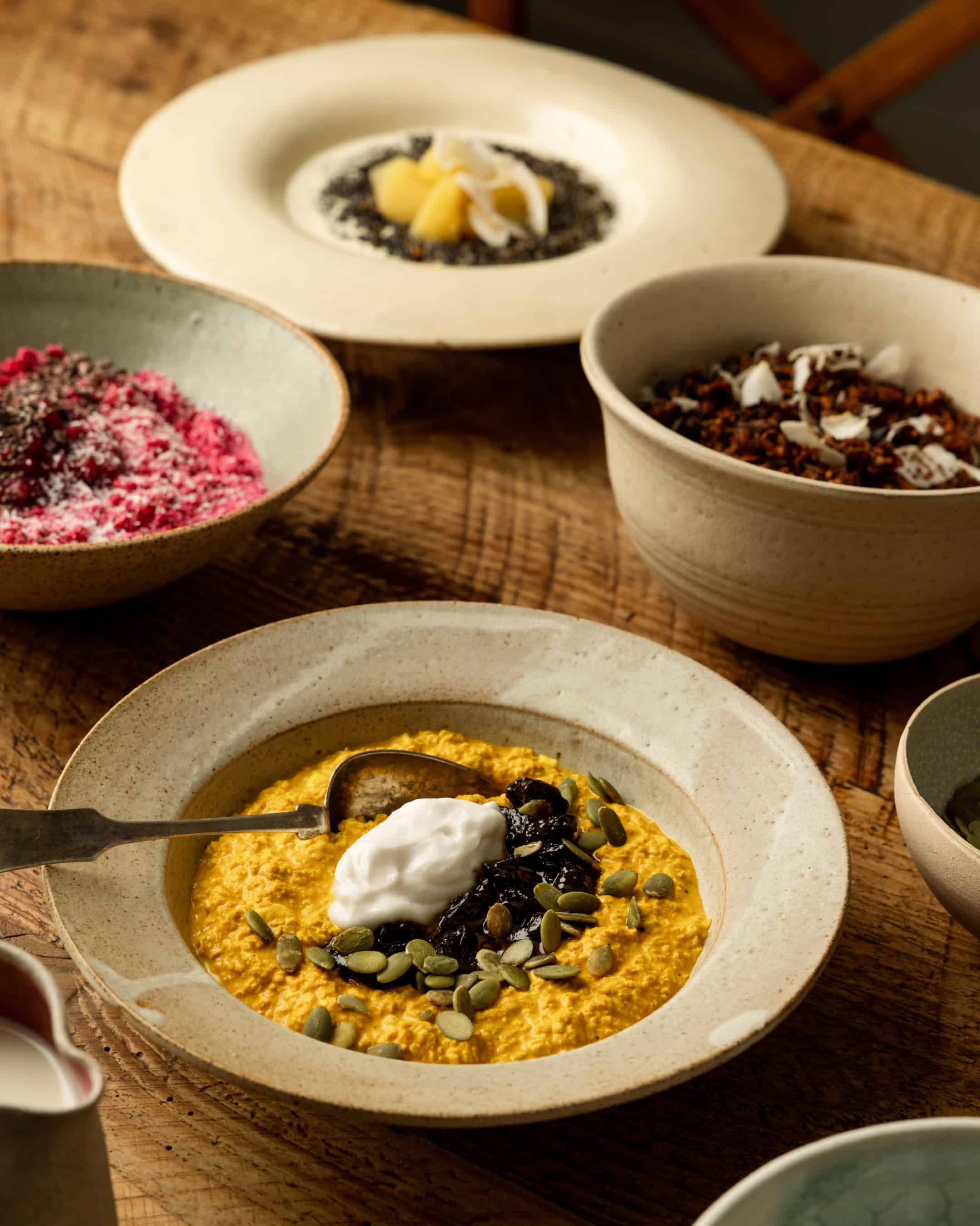
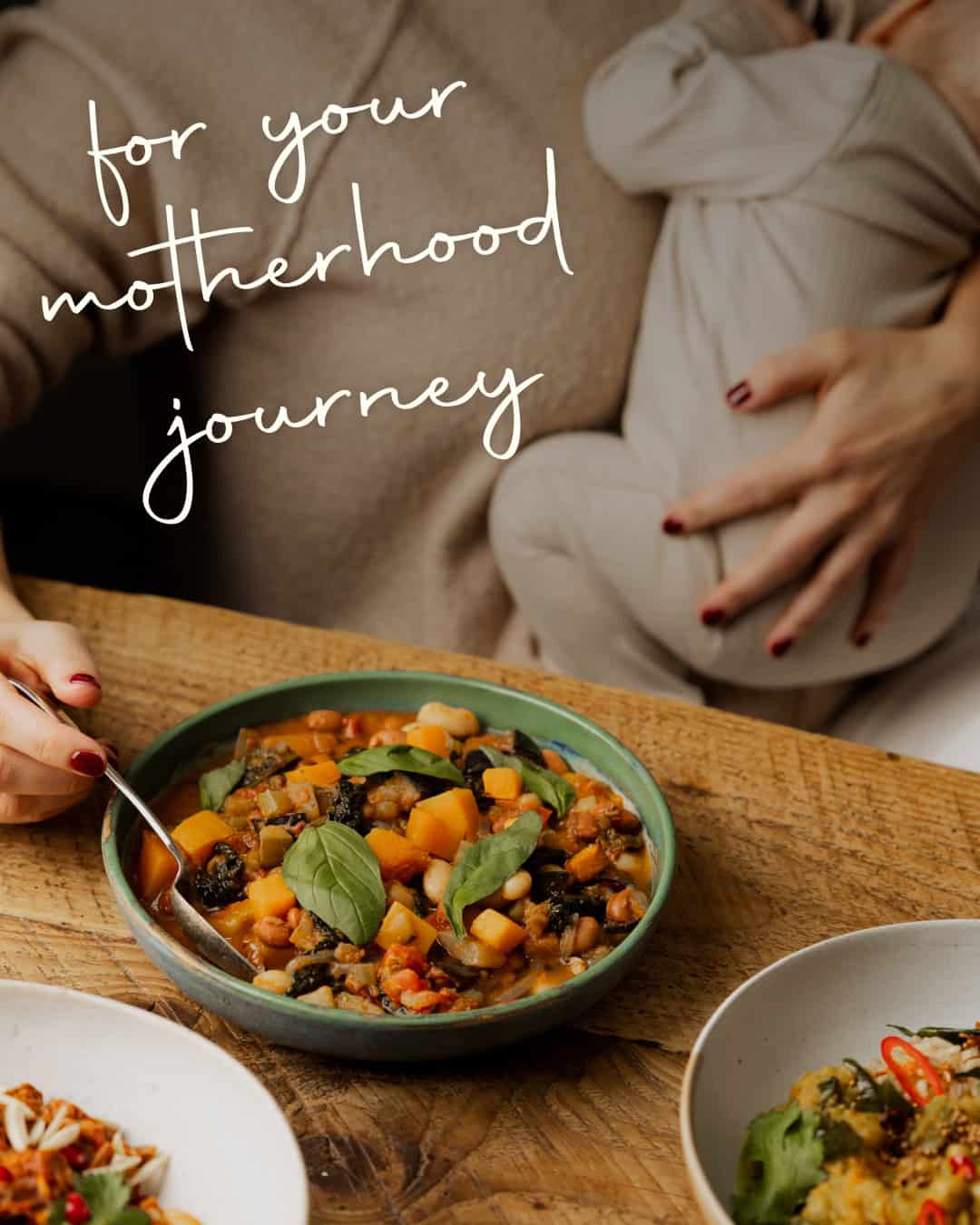
Motherhood doesn't arrive in straight lines. It arrives in the messy, magnificent, all-encompassing reality of pregnancy, childbirth and postpartum. The identity reflects exactly that. We drew our visual language from the journey itself: imperfect shapes that echo the female form, food that nourishes at every stage, and a design system that holds warmth and function in equal measure. The visual identity is deliberately human. Organic, hand-crafted forms sit at the heart of the brand.
MORE PROJECTS


